Customers come back five times before they ever buy. Nobody designs for visit four.
We pulled twelve months of session data from four South Florida small-business sites we audited. The serious buyers came back four to seven times before they made contact. Almost nothing on the page changed for them between visits, and that's where most of the lost business lives.
Most small-business sites are built for the first visit. The hero photo is dramatic. The headline is welcoming. The "About" page is a polite handshake. This works on first contact and almost nothing else, because the people you actually want to close are not first-contact visitors. They are people coming back.
We looked at the session logs of four owner-led businesses in the Miami corridor — a design practice, a café, a wellness studio, and a boutique firm. We tracked unique visitors who eventually became inbound customers, and counted how many times they visited the site before sending a form, calling, or replying to an email. The median was 5.2 visits. The mean was higher because of a long tail of buyers who came back fifteen-plus times before reaching out.
Why visit four is where you actually lose them.
By the fourth visit, the buyer knows the site. They know the hero photo. They know the "About" copy. They know what you offer and roughly what you do. If the site looks identical to the way it looked on visit one, the buyer reads it as frozen. Not as in broken, as in absent. A site that doesn't change is a site that isn't paying attention. They close the tab and move on.
The businesses with the highest visit-to-inquiry conversion rates had something in common that none of them could fully articulate. We named it. They were running second-look design: small, deliberate changes to the site between visits, designed to reward the returning eye.
What second-look design actually looks like.
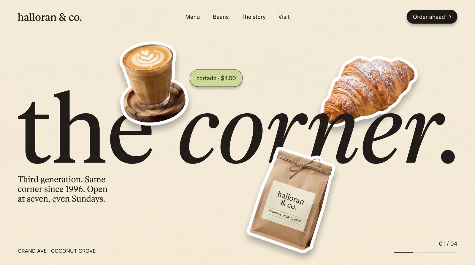
- A "what's new this week" surface above the fold. Updated weekly. The returning buyer scans for it. If it changed, the site feels alive. If it didn't, the site feels dead. Cost to maintain: ten minutes a week.
- A short note from the owner dated this week. Two sentences. Something like "The mango tree finally gave in, sticky buns all month." Not a blog post. A note. Dated. Casual.
- One piece of micro-content that changes every visit. The featured item rotates between three or four pieces. The neighborhood-of-the-week swaps. A small element rewards the act of returning.
- An interaction that didn't exist on visit one. A "save this" function that quietly appears after a second session. A "book a visit" button that surfaces when the same page has been opened twice. The site grows with the visitor's interest.
These are small moves. Individually they're almost trivial. Together they change the entire returning-visitor experience from "this is the same page I saw before" to "this person is paying attention to their own work." And that's the read that turns a fifth visit into an inquiry.
Your serious buyers will see your homepage thirty times before they email you. Design like you know that.
What this means for the build.
It means a small-business site is not a brochure. It's a living surface. The system has to be designed for weekly updates that take ten minutes, not for quarterly overhauls that take a weekend. The discipline isn't visual, it's editorial. Most small-business sites can't do this because they were built as one-shot deliverables. The ones that can are the ones that close on visit five.
Build the site for visit four. The buyer is already there.