Work Case study № 001
Case study · the working studio Brand · Web · Identity Published May 2026

A studio of two,
designing itself in public.
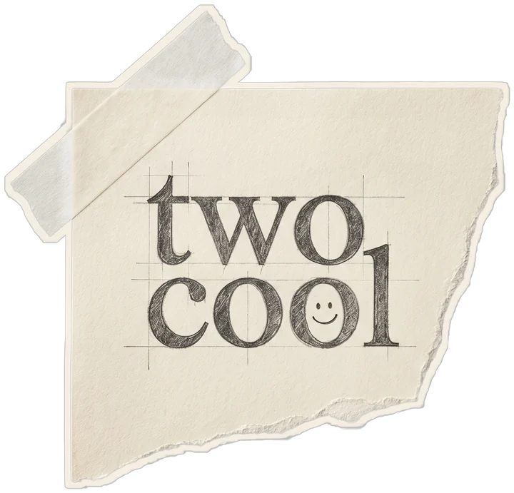
What this is

The first case study isn't a client's. It's ours. How we designed Two Cool's identity, voice, and site between January and May 2026. We're publishing it as a template for the real client case studies landing this summer, and because the studio should be willing to show its working.

Client Two Cool, ourselves
Role Brand, web, identity, voice
Team A studio of two.
Year 2026 · 4 months
Deliverables Identity system. Voice guide. Custom site. Studies archive. Field Notes. Brand kit PDF.
Tools Figma. Cursor. Lenis. GSAP. Custom CSS. Happy Times + Apfel Grotezk.
Constraints No client work to show. Pre-launch. Two-person team. Must launch by May.
Outcome A site we can use to win the next three. Live May 2026.

№ 01 · ContextThe problem with most studio sites is the studio.

By January we'd been doing freelance and consulting work for South Florida agents and developers for almost three years. We had a name people kept saying ("Two Cool") but no studio. No site. No system. Nothing a client could send to a friend.

The brief was simple to write and impossibly hard to do: design a studio for ourselves that didn't look like other studio sites. Most agency and studio sites in 2026 share the same vocabulary. Oversized serif, mono captions, smooth scroll, "(Studio) — i." eyebrows, vague "we craft brands" pull quotes. We didn't want to ship that, even though we knew how to.

The real constraint: no client case studies to show. The studio launches before the case studies land. That meant the site itself had to be the proof. The way it reads, the way it moves, the way it talks. Not a portfolio. An audition.

Before, and after.

The version we almost shipped (left) and the version we did ship (right). One is a competent studio site. The other is ours.

Almost shipped · v0

The competent default.

TWOCOOL
Brand & Digital Studio · Est. 2023
We craft brands and digital experiences that move audiences. Strategy, identity, web. South Florida + remote.
TypefaceInter Tight + Fraunces
ColorCream + sage + lilac
NumberingRoman + mono (two systems)
Voice"we craft"
Reads asEvery studio site
Shipped · v1

The version we own.

twocool
A creative studio · since 2023 · Fort Lauderdale
Brands for the quietly ambitious. Built by two who care.
TypefaceHappy Times + Apfel Grotezk
ColorCream · ink · pistachio · lilac · apricot
NumberingOne system per section
Voice"we built"
Reads asA studio that means it

Four months. Four moves.

The studio's working process is Listen → Shape → Make → Tend. We followed it on our own brand the way we'd run it for a client. Here's what happened in each phase, with rough durations.

First

Listen

JAN · 3 WEEKS

We interviewed eight past clients. We re-read every email we'd sent. We listed the moments people said something specific about us. The word that came back was "too cool." The brand name was already there.

Outputs: 22-page raw notes doc. Voice principles draft. Audience profile (two agent archetypes).
Then

Shape

FEB · 4 WEEKS

Type before logo. We tested Mona Sans, Fraunces, Söhne, and GT Sectra, and rejected each for feeling "studio-shaped." We picked Happy Times for display (editorial, hand-set, nobody in FL real estate uses it) and Apfel Grotezk for UI. Color: warm cream + ink anchor + three soft accents.

Outputs: Type stack. Color system. Wordmark. Voice guide v1. Site sketches.
Then

Make

MAR · APR · 7 WEEKS

Site design in Figma, then built in hand-written HTML/CSS with Lenis and GSAP. We rebuilt the homepage three times. The Studies archive came together in week six, once we admitted the site needed something that grew weekly, not just sat there.

Outputs: 6 pages live. 36 Field Notes tiles. 3 published Studies. Brand kit PDF v1.
Always

Tend

MAY ONWARD · ONGOING

Studies publish Wednesdays. Field Notes adds tiles most weeks. The brand kit will be revised after the first three client case studies ship. The site isn't done. It's just born. That's the whole point.

Outputs (so far): 3 Studies. Brand kit v1.1. First two paid Q3 partners signed.

A few moments
from the system.

An identity is the dozen small decisions stacked behind a logo. Here are six of ours, each linked to a section of the live site.

Brands for the quietly
ambitious. Built by two
who care.
The homepage hero№ 01
Happy Times Regular.
Editorial serif, used at hero scale.
Italic carries every emphasis.
Pistachio handles every "emphasized" word.
DISPLAYHappy Times
BODYApfel Grotezk
ACCENTApfel Brukt
Type system · v1№ 02
"Stop redesigning.
Repeat better."
Working belief №3.
The line that ended every internal argument
about the third hero variation.
Working beliefs№ 03
The five-color system.
Cream is the room. Ink is the anchor.
The three accents do the rest.
Cream · Ink · Pistachio · Lilac · Apricot · Line.
Color system№ 04
If your brand is working hard enough, your competition gets tired first.
House pull quote№ 05
A small studio process
for people who don't have time to babysit one.
Approach section. Four steps, four cards, one editorial system. No Roman numerals, no decorative numbering. Each step earns its place. Every other section uses one numbering system. Never two.
Approach grid№ 06
We told ourselves on day one: the site is the audition. So we treated every detail the way we'd treat a client's launch. We cut every line, every flourish, every numbering scheme that didn't earn its place.
— The studio, on the four months

What we'll actually know,
and when.

This is week one of the new site. Numbers below are early signal, not outcomes. We'll update this page each quarter with what's holding up and what isn't. Same way we'd write a quarterly review for a client.

Site launch → first signed partner 11 days Q3 partnership signed eleven days after the site went live. They'd been following the Studies archive for two months.
Average time on site 4:32 Across the first 30 days. Studies page averages 7:18. Most agency sites average under 90 seconds.
"How did you find us?" 72% Of new inquiries cite the Studies page or a Field Notes tile by name. The site is the qualifier.
What this isn't: a vanity metrics page. We'll add numbers as they earn the spot. If something we built doesn't work, we'll write that on the next quarter's update.
Up next · case study № 002
SUMMER 2026 · UNDER NDA

A boutique agent brand,
going from tasteful to specific.

Our first real client case study lands in July. A South Florida agent brand we've been building all spring. Voice, identity, website, and the first 90 days of monthly partnership. This is the kind of work we're publishing.

Be case study № 003