
Work/ Case study № 003
Project · Full brand system, end to end Client · Fictional, on purpose Scope · Identity → print → social → web → app 2026 · 4 months

Halloran & Co.

We invented a third-generation Coconut Grove coffee house and built its entire brand: every surface a real client would need, from the wordmark to the cup in your hand.

Why fake a client? Because new studios show fragments: a logo here, a mockup there. We wanted to show the whole machine running, and we weren't willing to wait for permission to do it.

Halloran & Co. is fictional. Every artifact in this study is real, designed, and production-ready.

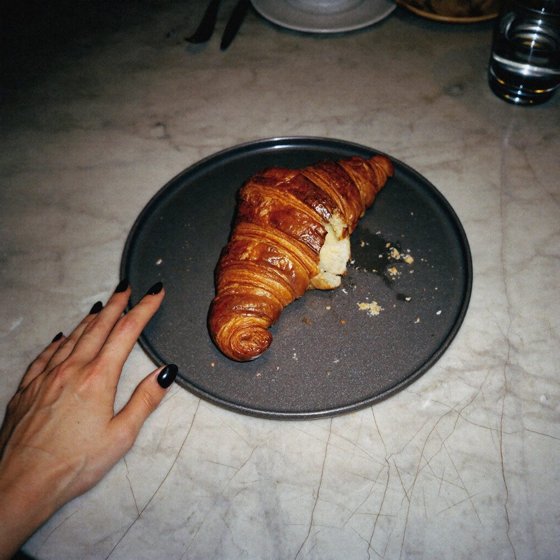
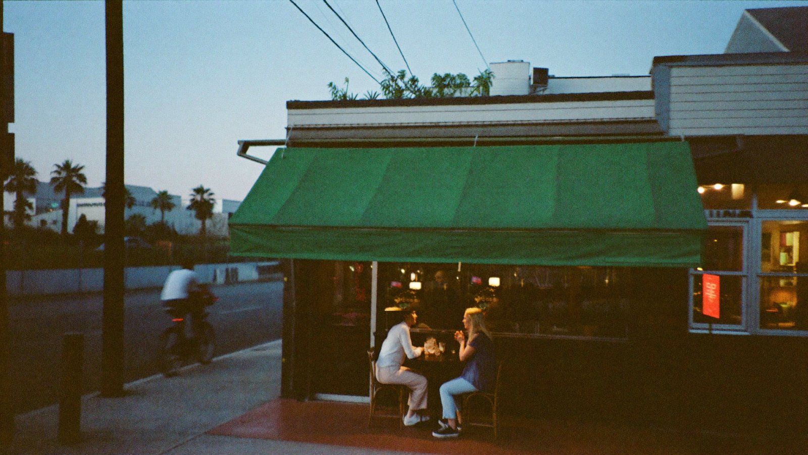
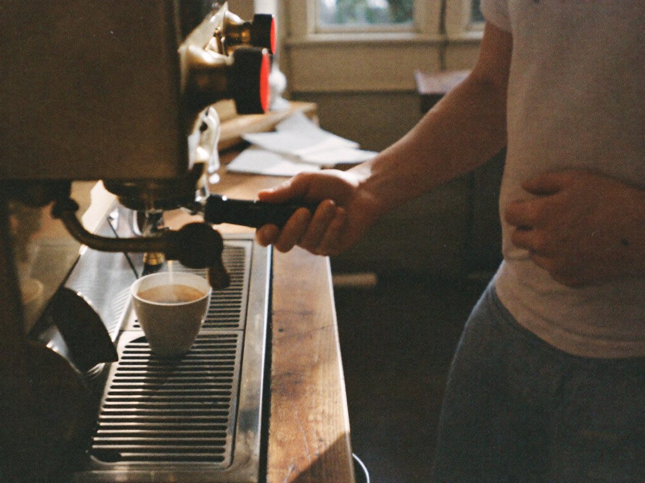
Grand Ave, Coconut Grove · the shop, on film
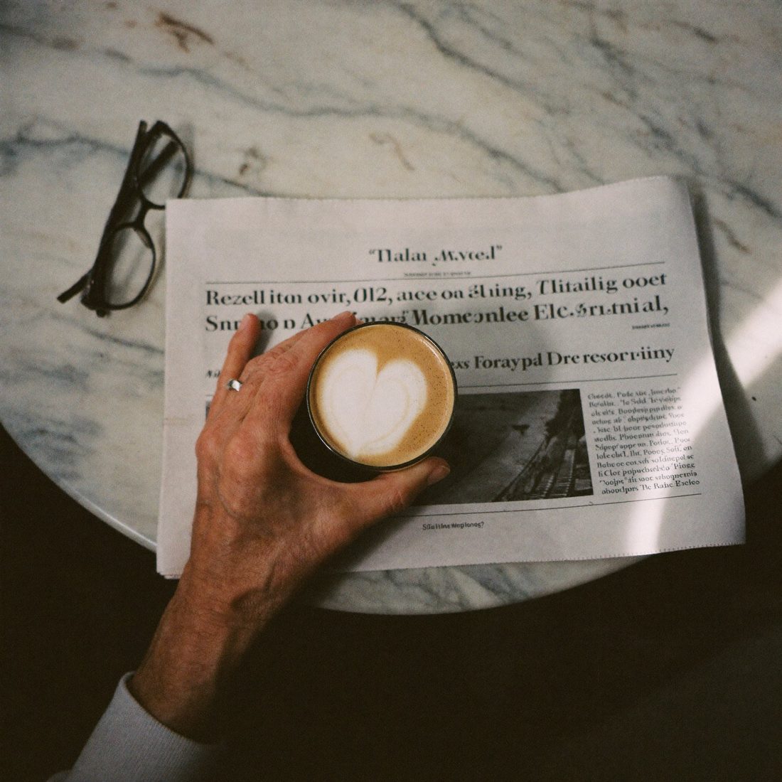
The brief we gave ourselves

A thirty-year name that never had a brand, only a reputation.

The fiction, precisely drawn. Maya R. Halloran. Third-generation owner of a Coconut Grove coffee house. Inherited the corner, the machine, and three decades of goodwill, but the marketing is a patchwork: a serif logo from 2009, menus from a template site, an Instagram run on apology energy.

She doesn't need to look bigger. She needs to look like what the shop already is: the corner the neighborhood quietly runs on. Quiet money, not loud marketing.

That sentence became the design test for everything that follows. If an artifact wouldn't survive on the marble counter next to the register, it didn't ship.

Identity

The mark is just the name, finally dressed for the work it does.

No emblem, no rooftop icon, no key motif. Happy Times carries the name; the italic ampersand and one apricot accent carry the personality. Restraint is the luxury signal.

Halloran
& Co.
Primary wordmark · Happy TimesA
h.
Monogram · the social avatarB
Maya R.
Halloran.
Owner lockup · signature weightC
Bone
Linen
Espresso
Burnt
Palm
Palette · Bone & BurntD
Open at seven,
quietly.
Happy Times 64 over Apfel Grotezk 24 · the only pairing in the system
Type pairing · headline and caption disciplineE
The system in the wild

One kit. Every surface a regular touches.

A brand for a coffee house isn't a logo file. It's the menu, the bag, the postcard, the feed, the site, and the app card, all speaking in one voice. Here's Halloran's voice on each.

House menu cover — the Halloran corner at dusk, regulars at the sidewalk table
House menu · cover, spring edition01
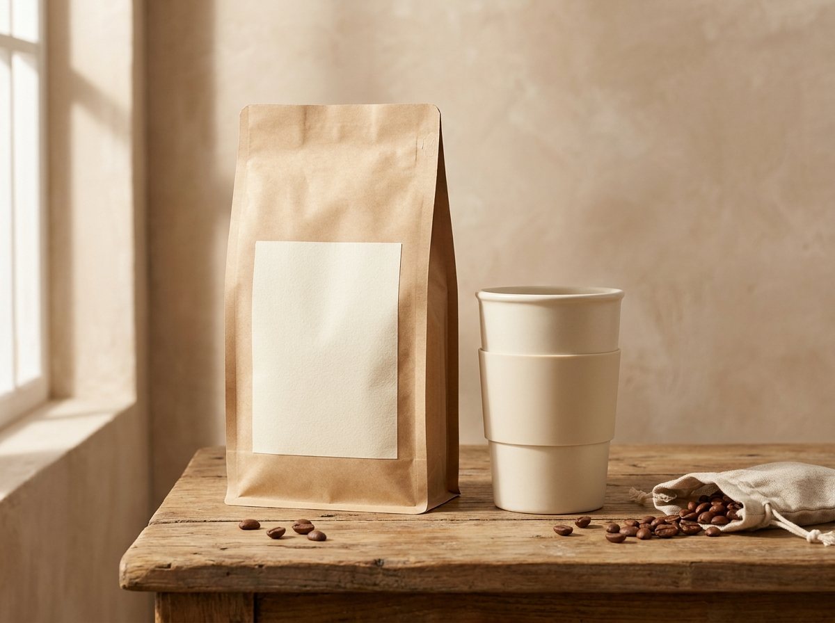
Halloran & Co. retail packaging — a kraft bean bag and a ceramic to-go cup on the counter, labels typeset by the studio
Packaging · the bag and the cup, typeset live02
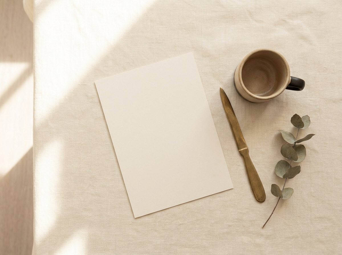
The Halloran anniversary card photographed on the studio table beside an espresso and a sprig of eucalyptus
Direct mail · the anniversary card, on the table03
Hi,
neighbor.
The counter, 7am
Open at seven.
Even Sundays.
The usual
Same corner.
Since '96.
What the
mango tree gave.
Quietly dark.
Sat pastry
A quiet patio.
Instagram · 30-day editorial grid04
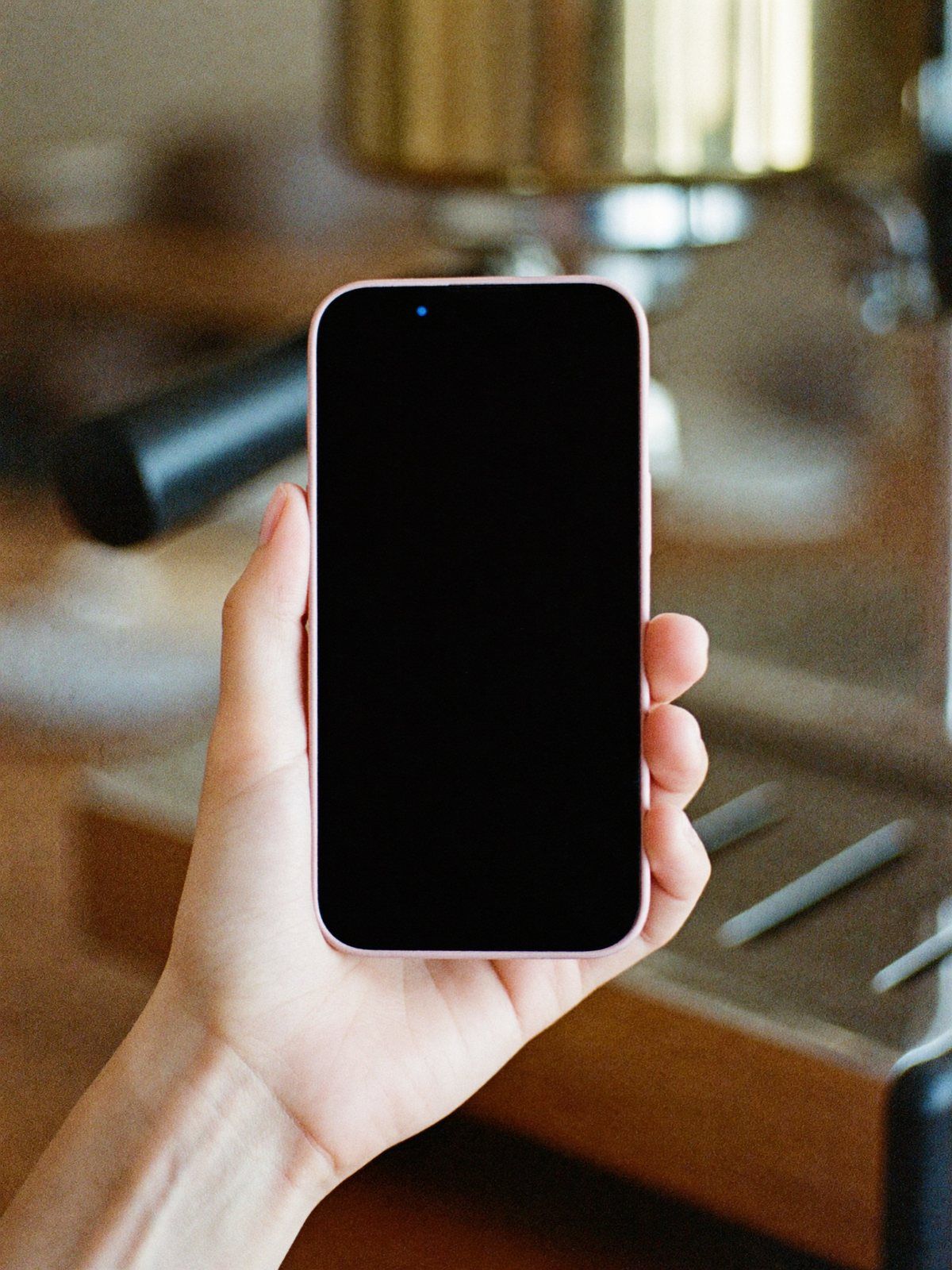
The Halloran order-ahead app photographed in hand at the counter — interface typeset live by the studio
Café app · in hand, typeset live05
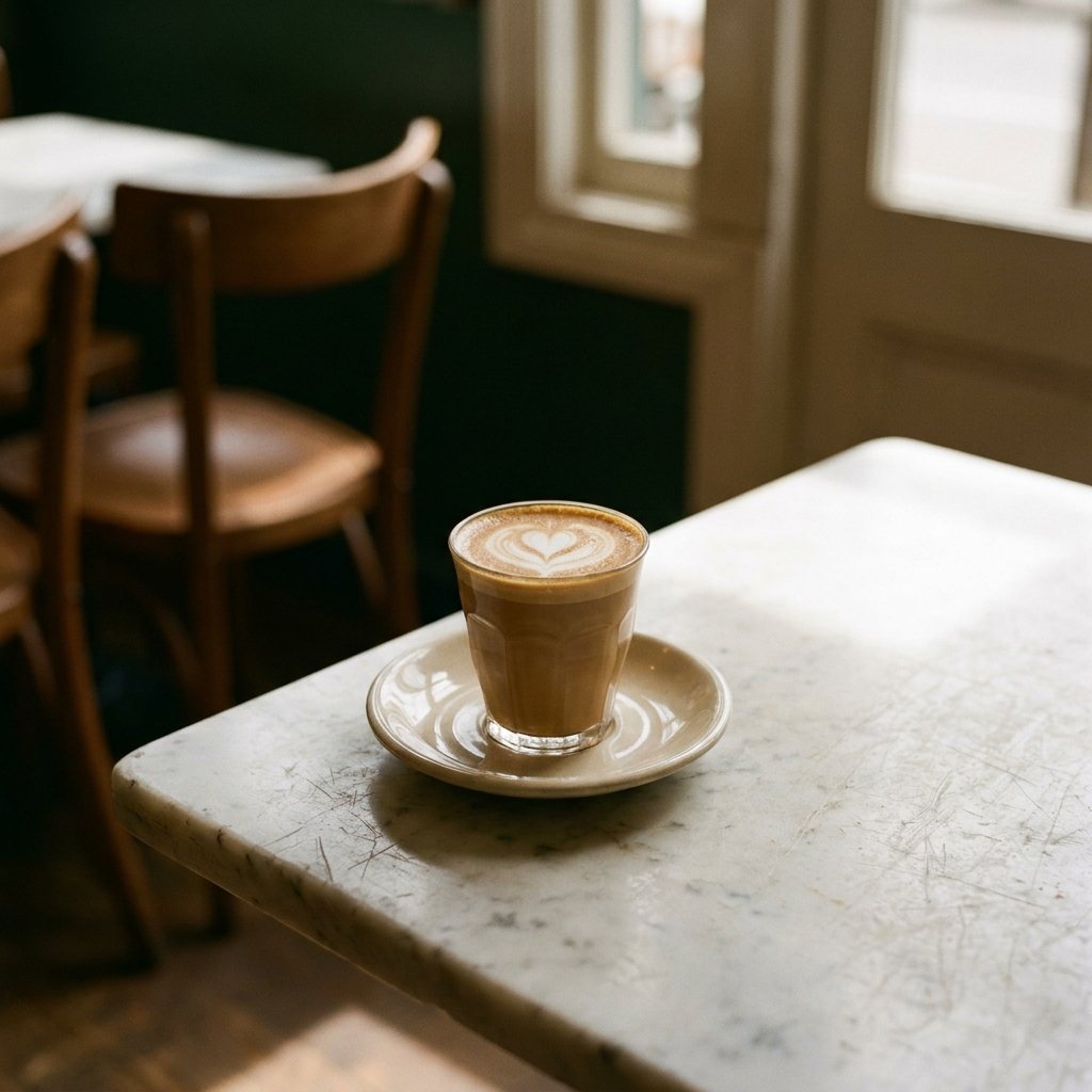
The pour · on film, for the feed06
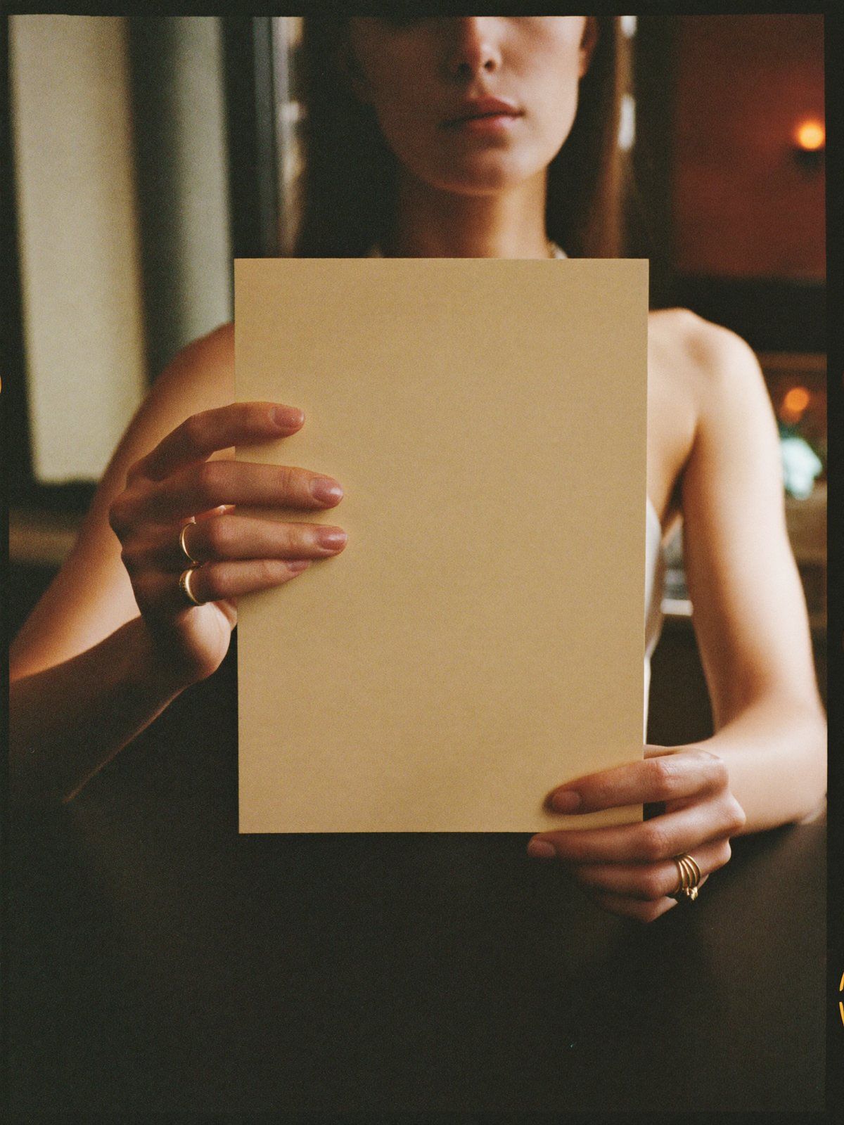
The Halloran house menu card held to camera — typeset live by the studio over the printed blank
The menu · in hand, typeset live07
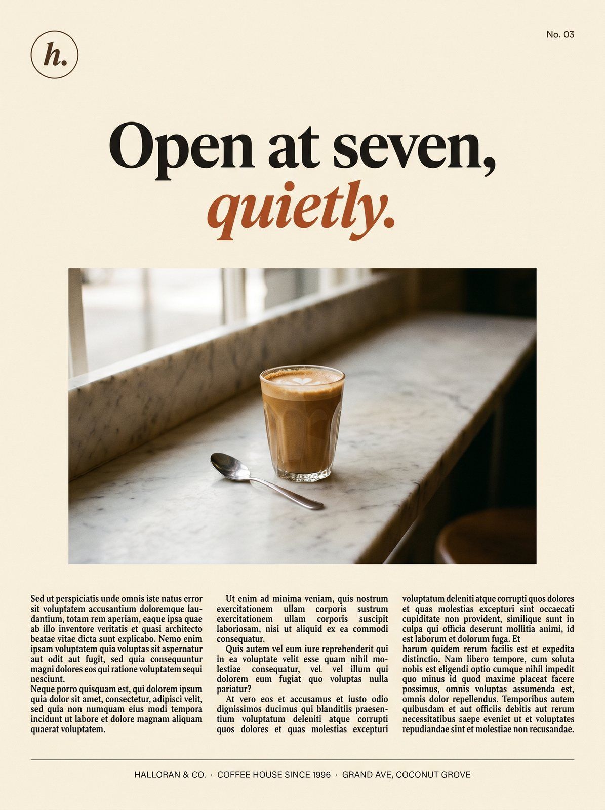
Halloran campaign print advertisement — Open at seven, quietly. A cortado on marble above three columns of editorial copy
Campaign print · open at seven08
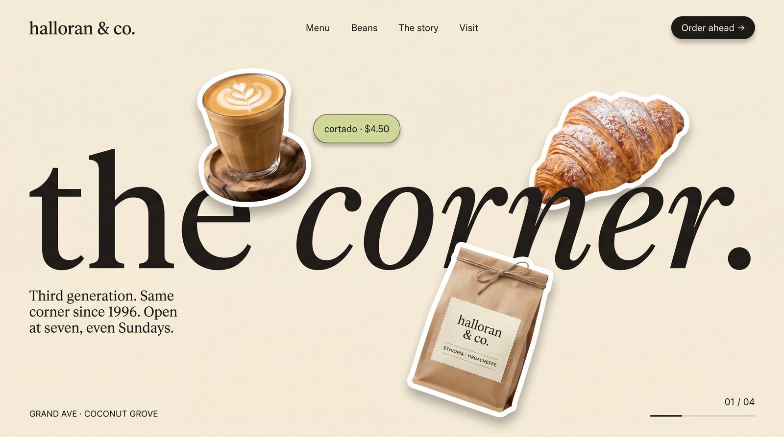
Halloran site concept — the corner. A giant lowercase serif headline with floating cutouts of the cortado, croissant and kraft bag
Site concept · the corner09
The rules that keep it together

A brand is mostly the things you refuse to do.

R·01 Sentence case, everywhere. Title Case Is How Templates Talk. Sentence case is how a person talks, and Halloran's whole position is that you're dealing with a person.
R·02 The italic is the only emphasis. No bolding for attention, no underlines, no color shouting. One italic word per headline does the pointing. Restraint compounds.
R·03 Numbers get the serif. Prices, hours, roast dates: the figures regulars actually read are set in Happy Times. Data presented like prose feels considered instead of scraped.
R·04 Illustration over stock. When there's no photography yet, the kit ships with commissioned dusk illustrations instead of a strangers-shaking-hands stock photo. The placeholder is part of the brand.
R·05 Every surface ends with a quiet ask. Order ahead. Save the corner table. Ask about the roast. Low-pressure, specific, and always the last thing on the page.

Maya isn't real. The standard is. Every artifact above is built to production spec, which means the first real client doesn't get a concept. They get a process that has already shipped a brand this complete, once, for practice.

Halloran & Co., Maya R. Halloran, and every address and figure in this study are fictional demonstration content, consistent with the disclosure on our work page. The craft, the files, and the four months are real.

Next

Your name could be the first real one.